THINKING SLOW THINKING FAST
CIS 6930 : Information Visualization
Ashish Aggarwal
Abhishek Kulkarni
Nishtha Srivatstav
Swarada Sathe
Advisor: Prof. Eric Ragan
Overview of the Project
Visualizations make it easier for the human brain to understand and comprehend complex datasets. It also helps detect patterns and draw useful insights from the data. Research on visualization of data using the conventional data encoding approaches is very vast and has been experimented with by many researchers. However, the relationship between the type of motion and data that is being represented is still not fully explored. We plan to study the effectiveness of motion in presenting quantitative data using moving visuals and compared them to traditional common static visual encodings by evaluating the responses of subjects exposed to both the visuals. We will further extend this work to understand different types of motion to evaluate whether it plays a role in perception of quantitative data. We fashioned a user study in which we showed various visuals with varying speeds to the study participants and asked them to identify the change in quantities such as area, length,angle and color gradients. We also asked the same questions with quantities represented using static visuals and compared both the results.
We aim to establish a relationship between motion and the traditional data encoding types and determine which encodings can be best used with motion to visualize quantitative data.
These results can be used to create effective visualizations where in temporal data is involved.
Example of a non-effective visualization:
Study Design
Position
Length
Motion
Area
Angle
Color
-
Slow speed
-
Medium speed
-
High speed
-
Static visualization showing two quantities
-
The encodings were selected based on the ranking provided by Cleveland and Mcgill.
-
Each encoding were combined with a particular kind of motion and was tested at three speeds to determine if speed plays a part in the perception of the data.
-
The survey was randomized to make sure to eliminate the familiarity component; the final values of the visualization were also tweaked.
-
In order to avoid memory component for the user, we used gifs instead of plain videos. Gifs run in an infinite loop and thus the user can determine his answer after a few repetitions of the gif.
-
Especially for length, we decided to test out two types of motion where in the directionality of the change was changed to determine which type of shrinking of the length bar is effective.
Survey Statistics:
-
21 questions in total
-
12 minute survey
-
36 overall participants
-
26 survey responses used for evaluation
Link to the survey:
https://ufl.qualtrics.com/jfe/form/SV_bHGa2Gn7YKLtw2h
Otherwise, here is a glimpse of the survey gifs that were used in the survey:
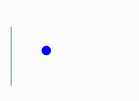
Position:
-
Static Visualization

-
Dynamic Visualization
Slow Medium Fast


Evaluation Methodology
Collection of data - answers given by research participants
Calculate error of the answers for each visualization
Calculate median error of the answers for each visualization
| Participant answer - Actual value |
Use one-way ANOVA test
For post-hoc analysis, use Bonferroni test
To compare different visualizations of the same encoding
Pairwise testing for a single encoding
After completion of both of the tests on the data that we collected, we found the following results:


Conclusions
-
We observed significant difference in perception when we add motion to the visuals for encodings angle, position, color and length.
-
Our tests did not show any significant difference in perception of area for static and moving visuals.
-
There is no conclusive trend to differentiate between the accuracy for the static or moving visuals. We also could not find a trend suggesting that a certain speed is better than the others.